1. In what ways does your media product use, develop or challenge forms and conventions of real media products?

Click. Flash. by Trifecta/Heatstroke was a 2011 finalist for the National Film Challenge
http://filmchallenge.org/2011-Finalists/2011-finalist-click-flash.html
The story is about a broken down country singer who finds that having a simple drink is much more than what she bargained for.
I choose this short film because it is very powerful as it shows an innocent person having a drink and what the outcome could be. The film is extremely well done visually and audibly and the scene transitions made the story even more exciting and un-expectable that it makes you shiver.
Representation:

- This film deals with the issues of drink driving and the risks you take when driving intoxicated. The facts are that even an innocent person who would never hurt anyone like the country singer can do such damage to someones life, including death. It sends across messages of how easy it is to kill someone when driving and the responsibility an individual has if something goes wrong.
- The genre is 'fantasy' and 'drama' because it is what she is dreaming in her head at the bar as she did not understand what she had done wrong and why a women was laughing at her.
- The expected audience for Click. Flash would be between the ages of 20-35 and either male and female as they may be able to relate to her.
- Negative representations are shown as it is a young female character therefore, it is seen as if only young people drink and cause accidents while driving. However, the ambulance people see to be acting alot more like older adults and are showing more of a looked up to figure.
Narrative
- The film does not give much away to the audience until it starts to get to the end of the film that we identify she is involved in a car crash and the plot is that she had killed someone down to her drinking. The story makes us understand that she is drunk and that the characters at the bar are all seen at the driving accident scene.
- It is a circular narrative structure because the film begins with her car driving along a road late at night and it then flashes back to her at the bar earlier on, and then takes us back to a similar point by the end of the short film of her driving and then hitting into the women who is jogging on the pavement. This creates an impact on the audience as there must be a reason why the film starts with a point of view shot of someone driving and how the end of the film almost gives a shock as it is very graphic and unexpected.
- David Bordwell and Kirsten Thompson say that the story includes everything that has happens in their lives and this is also events we do not see. Therefore, the plot only includes events of the story that we see in the film. In this case we only see the female character driving and at the bar, we have no idea why she is feeling down or what has happened to her to make her drink and drive and the reason for her reactions. The events in the story are 'plotted' to create a narrative.
- An action code is used in this narrative as we see flickering lights, a bottle of alcohol dripping and the sound of sirens start to get louder. This kind of code tells us that an action will take place and enables the audience to engage and predict the plot.

Genre
- Short films typically using genre as they are smaller in length of time and they must have a plot and story therefore it must be categorised into a genre to be identified.
- Click.Flash's genre is fantasy and drama because she is dreaming and the scene at the bar is very confusing as the audience have no idea why the characters are acting strange, rude and manipulative towards her, until the end where it all unravels.

Audience
- The this type of film makes your 'spine shiver' as it is very dramatic and surprising about what is about to happen as no one would want that to happen to them.
- The makers of the film try and get the audiences expectations high as the film draws to a close as the bar stuff start to shake her, point bright lights in her face, almost trying to scare her. She then realises that her guitar is broken and smashed it. This may symbolise that her life is over even before we have seen the accident.
Media Language

- The film begins with a series of point of view (POV) shots. The first shot is the sight of the road and the vision in which someone is driving a car. The image in which the car is moving seems blurred and unsteady. This instantly gives the audience an idea that the driver may not be completely concentrating and stable.
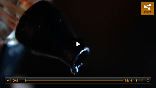

- A close up is taken of a wine bottle which is leaking. This particular shot is repeated three times throughout the short film indicating that an event relating to alcohol has either happened or is about to happen. The shot is very dark and mysterious, still not giving away anything including what exactly the alcohol is. The audience are left anticipating the outcome of this shot.
- Throughout the entire five minutes of this short film there are constant references back to alcohol. Firstly, the barmaid pours wine into a glass, there is a close up shot of this directing all our attention onto the alcohol. The liquid is red symbolizing the accident that is going to happen, which the audience will later find out. The barmaid passes the glass to the customer who immediately downs the drink. This indicates to us as an audience that maybe the customer is an alcoholic or that something is troubling her.

- The audience gets introduced to a third character who keeps laughing to herself. She comes across as very suspicious as her face is not shown until later and there is no indication as to who she is. The women regularly laughs throughout the duration of the scene, still giving no information away, including her identity. .

- We then see a forth character who is asking for a 'light' and just like the others he is coming across very mysterious. This close up shown signifies that the audience are oblivious to who this man is and why he is there.
Two Cars One Night - http://www.youtube.com/watch?v=R6Pc6cBP-8U
 Narrative - As shown in 'Two Cars One Night' a common feature of a short film is a simple narrative idea as the more simpler a short film is the more creative you can make it. It involves three children waiting in a car park for their parents and the female and one of the male characters start talking in a humorous but sweet way and in the end they exchange a ring. Nothing exciting is mentioned but this gives a chance for the creators to really elaborate on their camera work and effects. Although, many short films feature no or hardly any narrative but are still good to watch.
 Lovefield - http://www.youtube.com/watch?v=4meeZifCVro

Genre Conventions-
We tried to create the same effect as this short film. The audience is completely taken back by this film at the start as we immediately think that the male character is hurting this women as she is screaming in a corn field and she looks very weak. However, towards the end we then realize he is helping her deliver a baby. It creates a story that takes the audience on a roller coaster ride of emotions and combines elements of horror, suspense and drama.
We tried to create the same effect as this short film. The audience is completely taken back by this film at the start as we immediately think that the male character is hurting this women as she is screaming in a corn field and she looks very weak. However, towards the end we then realize he is helping her deliver a baby. It creates a story that takes the audience on a roller coaster ride of emotions and combines elements of horror, suspense and drama.

Mise En Scene -
The short film is set in a corn field which looks to be in the middle of nowhere this creates the feeling of vulnerable and lonely. Short films are known to only use a limited number of locations as they have such a short time otherwise time can be taken up. As shown in Two Cars One Night only a location of a car park is used.
The short film is set in a corn field which looks to be in the middle of nowhere this creates the feeling of vulnerable and lonely. Short films are known to only use a limited number of locations as they have such a short time otherwise time can be taken up. As shown in Two Cars One Night only a location of a car park is used.
Our first impressions of the representation of the male character is that he is a hillbilly and looks very dirty and horrible. Also, we see a mid close up of his tattoo on his arm of a skull representing death so we immediately think he is a murderer.
As in our film, short films tend not to give anything away till the end as all we see in Lovefield is a small womans foot and we do not see any identifiable clothing or facial areas.

We used alot of cross cutting from one character to another to create more suspense and intensity as made it flick faster to make the audience feel more on edge.


Narrative: We used the codes and convention of short films by keeping our narrative simple and easy to follow, as from past experiences the film can be hard to understand if made too complicated. We stuck with two main characters and two different locations to keep it simplified as the most successful short films are very simplistic. Our film is about a female character who realised she has lost her wedding ring while at work and rushes home to see whether it is there. In the meantime the camera flicks to a suspicious man who seems as if he may have broken into the house and is looking for something. We tried to make the film as intense as we could by cross cutting from one to the other to emphasis the meeting of the characters at the very end. We kept to the linear narrative so it starts with an equilibrium and finishes with the resolution in terms of the Todorov theroy.
However, the female is a modern representation as she is working and trying to look after the house at the same time. She comes across as very caring and not that quiet. Also, she is not relying on the man to go and check the house, she is doing it herself. She is independent.
 Camerawork: Overall, we used the forms and conventions of many short films through the camerawork. We used a range of shots from close ups, low angles, point of view shots to really get the feel of how the characters are feeling and to make our short film more interesting and fun to watch. It also builds a relationship between both the characters and the audience. We did things such as put the camera in the draw when it was opened, high angle shots looking down on what the character is doing, shots of facial expressions up close and looking through windows. Also, the best of the best shots i feel we did is when the female character switches on the engine and then we see the exhaust start up with smoke coming out of it conveying the idea of urgency.
Genre conventions: In terms of genre and its conventions we used drama which normal people can relate to as it seen as very realistic rather than a horror. It almost creates a connection between the film and the audience which then normally is effective and creates a successful film. Our film portrays the journey of our two characters development and the heart of the drama is the conflict at the end as we keep it intense till the very end.
Mise en scene: The use of mise en scene was important in our film to ensure we got across the theme of the characters and what sort of people they were. The female character is dressed smartly as she has been at work this explains that she upper class, whereas the male character is harder to tell because he all in black clothing showing no colours of personality or conventions. When it came to locations we challenged the codes and conventions of real media products because there is normally only one location used as it can cause confusion for the audience as there is little time to film. There is alot of travelling and cross cutting from each character but we tried not to establish the location in the first scenes so the audience weren't question where they were.
Themes and issues - We did not focus on a particular theme or issue unlike many other short films therefore we challenged the codes and conventions of real media products by not giving the audience what they expect by not highlighting an issue. However, you could say it is how the audience perceive the male character to be (antagonist), and then at the end the film proves them wrong.
Ancillary Tasks
Conventions of movie posters:
As shown below these are analysis of films i have already completed and identified their audience, genres, themes, mise en scene, issues and narrative.
Wild Bill
Trailer - http://www.youtube.com/watch?v=zo5IaRnKyFk

Narrative
- We can tell the main character by looking at the poster as he is situated in the middle of the frame and closer than the other characters in the background.
- He comes across as being quite a rough male character as his appearance seems dirty and he has cuts over his face indicating he may be involved in violence.
- The characters in the background range from a man and a women dressed smartly looking very formal compared to four young men all wearing big jackets and either wearing a hat or their hood up. This indicates to the audience it may be the main characters gang or friends he is involved with and are key parts of the film. However, the characters dressed more formally may be the people that are after them as they seem like opposites.
- The theme that is communicated with the audience is that the film is associated with British criminals and working class people as the main character does not seem to have alot of money as his clothes look dirty and his face looks all beaten and bruised And by the look of his fists we can see that he is involved in alot of violence.
Representation
- The poster is representing working class men who may have been involved in crime and just been released from prison. The ages of the characters range from young teenagers to middle aged adults showing that this film may be about the family of the criminal and how it effects families as well as the society in modern day life.
- The more formally dressed man and women are looking at the main character or at the other characters in a bad way this shows that they could be after them for something they may have done. The other characters are looking towards the audience where the main man is looking this indicates that they are part of him and involved with him.
- By just looking at the poster we can only see an outline of places in London representing that this film is set in the back streets of London, this shows to the audience how rough the boys are. The main colours used are black and yellow. The yellow is darkened which represents dirt and unpleasantness and the black may represent death or depression. Also, i have noticed that two characters in the background are dressed smartly in black which portrays one of class elegance and wealth. Classy clothing is designed in black such as the mans suit and the females smart top, this shows they are higher up than the other characters.
Genre
- This film comes across as being a drama film as it is about Bill when he comes out of prison and what he has to face with. It is about him and his sons as they have been abounded by their mother and he has no choice but to look after them. This is also showed in the star reviews 'Outstanding' or 'A Hugely Enjoyable and Impressive Debut'.
- It is very interesting the way the films title is on Bill's knuckles looking like a tattoo saying 'Wild Bill'. Tattoos are permanent markings on the body which portrays that Bill will always be wild and uncontrollable. Also, they are seen to make a person look unattractive and dirty and limit a persons opportunities in life because of their negative connotations and associations. 40% of companies will not hire a person with tattoos therefore already the poster shows that this film represents crime and violence on the streets with people such as bill being unemployed and creating drama.
- Violence and crime are probably key aspects of this film because the poster is nitty and gritty and there are fists shown up closest to the poster expressing that he is going to hit someone. Also, we can see flat blocks in the background in London and we know that crime often happens on flat blocks especially in the capital of the UK where there is alot of gangs.
Audience
- The audience of this film would aim towards young adults and the older generation because the films certificate is 15 therefore their would be content which involves bad language and violence. I feel that mainly men would watch this film because the characters are mainly male as well as the themes and issues that are tackled in this film. However, there are some female characters therefore some females would be interested in watching this film and interested in the themes shown in the poster.
- This film aims towards working and middle class people because it is located in the crime areas in back streets of London. Upper class people would not really be interested in watching this as they could not relate themselves to the situation.
Film Language
- Facial expressions play a vital part in this poster as not one of the characters comes across as being in a happy mood. They all seem very serious portraying that this film is not to do with comedy but with serious issues to do with London crime.
- The mise en scene of this poster, especially the way in which the characters are positioned with his fists being bigger than anything else, creates a sense that he is more powerful than them and is in control. It is as if he is the one that causes the most mischief.
- The way in which the star reviews and the names of the actors are all positioned very accordingly and look very neat and bold to make sure that they stand out from the yellow background. They are also all in capital letters this makes the words seem as if they are being outspoken and like the characters are 'too much'.
- There is a mid-shot of all of the characters in the background so we can see what they are wearing. This shows to us exactly what type of people they are, their attitude to the way they live and representations of that type of class in England.
Now is Good

Narrative
- With this poster we can immediately tell who the main two characters will be in the film as they almost take up the entire frame and just by looking at the poster we can tell that they are very connected to each other. However, the audience can see the movie will be mainly based on the girl as she is looking towards us, creating more attention towards her. It is although he is protecting her.
- The background is of the sky, portraying that they are in heaven or in a very happy place. Or it may be that someone is passing away.
- 'Live every moment, love every minute is the tag line, this instantly gets us thinking that the female is ill as we say this when someone passes away. We realise how short life is and that we should all live life to the full and make the most of it. In the film we realise that the girl has leukaemia and has given up her treatment.
Representation
- The representation of gender and sexuality are shown in this poster. The characters are obviously in a relationship as they are within close proximity and are wearing similar colour clothing in order to relate themselves to each other.
- Also, they both seem as if they are feeling down especially the male as he is looking downwards as if he is sad that she has an illness. He is also wearing a darker coloured top. However, the female is looking upwards towards us representing that although she has a deathly illness she is still strong.
- In the title the word ' Now' is a different colour to the rest of the words which tries to emphasis that she has not got much time as it could be 'later is good'. It ensures that the reader of this poster looks more at this word and understands that maybe her illness is killing her and that she wants to do as many things as she can in the rest of her life.
- The background of this poster is of a blue clear sky with some white clouds and it looks just like you would of heaven. It gives a more clearer representation as when someone dies they go to heaven, it is known to be a very calm place. Also, they are blocking the sun light behind them but it seems as if there is more light shining on her highlighting to us that this film is based around her.
Genre
- I would say the genre of this film is romance and drama as it is about a real life situation involving love. However, the plot is that she is dying from the disease and wants to live ever moment of her life to the full that she has left.
- The actors names are in yellow and so is her cardigan. Yellow is associated with joy, happiness intellect and energy. This may represent her character and what her personality is like while she is suffering from leukaemia.
- I feel all classes from working class to upper class would enjoy this film as it can touch anyone. Suffering from an illness such as leukaemia is very sad and can have an impact on anyone's life no matter how much money they have. Also, people who appreciate romance films which is mostly female like to watch people in a good relationship (as shown in poster) to get an idea on what they want to have in the future and get enjoyment out of seeing someone in love.
Audience
- I feel the main target audience is teenage and young adult girls as it would be very emotional and is based around love and affection which normally only females like to watch. The certificate is a 12A therefore any girl as long as they go with an adult if under 12 are able to watch the film.
- However, the film could relate to both genders if they have been put in a situation with someone who has leukaemia or if they have lost someone due to the illness or even if they have been diagnosed themselves.
- It is based on a book called 'Before I Die' by Jenny Downham which is a young adult novel therefore, any young adults or anyone else that has read the book will be more than likely to watch the film.

Film Language
- The colours of the fonts and the characters clothes are very similar contrasting from a range of blue, yellow and white. This overall makes the poster look connected as a whole and make the poster pleasant to look at. They are soft, not harsh colours symbolizing that the film story is very touching and emotional.
- In terms of positioning, the characters are taken in a medium/close up shot as we can clearly see their facial expressions, they both look very sincere and serious. Also, we can see a small part of their clothing aswell as the background as they are roughly similar colours which indicates they all have something to do with each other.
- Overall, this poster is very eye-catching as we can fully see the characters and it attracts its target audience by the use of soft, easy colours and we can already tell what the movie will be about by the tagline and the way the characters are pictured.
Poster conventions:

- The films name needs to be displayed clearly and must stand out from the poster. Also, to see what it is advertising.
- The added convention is quotes from the film giving the audience a feel about what the film is about.
- The actors names are important on a poster especially if they are well known as it will promote the movie, whereas if the actors are unknown people may not be as excited to see the film as they do not know who is in it.
- A tag line is another convention to a poster as it makes the movie original and one of its kind. Also, to give the audience an insight into the story.
- The date the film is going to be released is vital in a poster as it tells the audience when they are able to go and see the film and whether it is coming out in the cinema or as a DVD.
- Every poster must include text at the bottom displaying the director, actors, production companies and funding logos.
- Another convention is quotes the film has received from newspapers, magazines or viewers expressing what they thought about the film, they would want to put this on the poster to show it is a good film.
- The images used must reflect the movie in some way for the audience to be able to identify its genre, themes, issues, actors and many more.
Most of the conventions mentioned above are for a big budget film posters which has an actual release date, whereas short films are not advertised in this way so short film posters may not have all these conventions as they are not needed.
Does our poster use, develop or challenge forms and conventions of real media products?
- The films name needs to be displayed clearly and must stand out from the poster. Also, to see what it is advertising.
- The added convention is quotes from the film giving the audience a feel about what the film is about.
- The actors names are important on a poster especially if they are well known as it will promote the movie, whereas if the actors are unknown people may not be as excited to see the film as they do not know who is in it.
- A tag line is another convention to a poster as it makes the movie original and one of its kind. Also, to give the audience an insight into the story.
- The date the film is going to be released is vital in a poster as it tells the audience when they are able to go and see the film and whether it is coming out in the cinema or as a DVD.
- Every poster must include text at the bottom displaying the director, actors, production companies and funding logos.
- Another convention is quotes the film has received from newspapers, magazines or viewers expressing what they thought about the film, they would want to put this on the poster to show it is a good film.
- The images used must reflect the movie in some way for the audience to be able to identify its genre, themes, issues, actors and many more.
Most of the conventions mentioned above are for a big budget film posters which has an actual release date, whereas short films are not advertised in this way so short film posters may not have all these conventions as they are not needed.

- The films title is located at the bottom in a large font so it stands out and catches the audience's eyes. It is easy to read and understand because it is the largest text on the poster and is the opposite colour to black.
- We wanted to keep our poster simple and not over crowded as we do not want it to be seen as an eye scorcher. We only used three images one of which one is of the house and then two close ups of me and Curtis. As represented in many other film posters, we have taken separate pictures of the two main characters wearing the same clothes but just taken separately to emphasis their facial expressions, lighting and body language. Our poster does not give much away as the film is based around mystery and the unexpected.
- On nearly every movie poster that we see the actors names are mentioned clearly and are highlighted therefore we decided to do the same. Although our actors are not Hollywood stars, actors names make up a movie poster and the audience can clearly see who is playing what character.
- We made the text at the very bottom which states the production company, cast and crew members to show who was included in the making of the film. Also, we have used funding logos such as BBC films and Lottery funded to identify who helped the financial side of the film.
- Another convention we have used were quotes and reviews from media places such as newspapers. We added these to our poster to highlight to the audience what people enjoyed about the entire film and the good points so it would attract more attention. Also, it had a positive impact on the poster aswell as it shows that the general public have good reviews on the film.
- Overall, I feel our film poster is very effective and targets our audience of young adults with the use of colours, themes characters and editing. However, i feel we could of added a date of release to tell the audience when they are able to see it in the cinemas or on DVD.
Review

The first Little White Lies magazine was published in 2005 by The Church Of London. It is a British movie magazine and is distributed throughout the UK in shops including WHSmith, HMV and urban outfitters.
They reach their customers through high street distribution and subscriptions. There is on average 16,500 copies sold and this is then read by 4 people. Also there is 2,000+ subscribers.
The magazine takes one main film and uses this as its theme. As shown for example; The Black Swan.
They reach their customers through high street distribution and subscriptions. There is on average 16,500 copies sold and this is then read by 4 people. Also there is 2,000+ subscribers.
The magazine takes one main film and uses this as its theme. As shown for example; The Black Swan.
Target Audience:

As shown above Little White Lies main audience is males aged between 25- 35 and work within the media and creative industry. We can see from the content of the magazine that it is aimed at informed and educated media fans aswell as people who are interested in art and graphics because alot of the magazine is hand drawn and created through IT.
The advertisements that are featured in the issues are things such Wild Bill film release, A horrible way to die DVD, intellect books and AV festival which is a festival for Art, Tech, Music and film. All of these advertisements are aimed at males who are interested in the film industry as Wild Bill is a film about a gang in London. Also, the DVD of a horrible way to die does not seem appealing to females as i have never heard of any of these advertisements featured in the film.
The advertisements that are featured in the issues are things such Wild Bill film release, A horrible way to die DVD, intellect books and AV festival which is a festival for Art, Tech, Music and film. All of these advertisements are aimed at males who are interested in the film industry as Wild Bill is a film about a gang in London. Also, the DVD of a horrible way to die does not seem appealing to females as i have never heard of any of these advertisements featured in the film.
This is a review i have taken from Little White Lies.

- The design and the layout of little white lies reviews are all the same. Normally a screen shot or still image is used at the top to illustrate what the film is about and the characters involved.
- The title of the film is normally in bold and in a large font below the picture.
- Underneath the film title is three headings 'Directed By', 'Starring' and 'Release Date', this gives more facts on the film to give the reader all they need to know about the film before they read the review.
- Another major part of the review is the ratings the magazine have given the film out of 5 for anticipation, enjoyment and in retrospect. This overall sums up the film and gives the audience an idea on how good the film is going to be.
- When it comes to the language there is roughly 550 words and approximately 6 paragraphs. The reviews have to be very justified and just give an overview of the film without giving too much away.
- Each column is 52.4mm wide and 107mm long.
- The use of nouns, adjectives, complex nouns, rhetorical questions, complex language and many more.
Example of what's involved in review:

Each paragraph:
2. Link to characters
3. Introduced protagonist
4. Genre - Repetition and variation from standard with references to other films
5. Directors inventions, themes and aspects of style
6. Genre repetition and variation from standard such as key scenes and unique elements.
7. Summary of end scenes importance; distinctive genre features compared to Hollywood's styles. Finishing with a positive last sentence as little white lies have given the film a rating of 5 out of 5.
Does our review use, develop or challenge forms and conventions of real media products?
Here is our final review:

- In our review we have used the same conventions of the Little White Lies Magazine. We didn't challenge or develop the conventions of the magazines because it would not look like the magazine itself as it has a particular style.
- We followed the language in which Little White lies write their reviews and in each paragraph we covered different areas such as the characters, directors style, summary of film and the genre conventions used.
- The audience of our film have us a 4 for anticipation, 3 for enjoyment and 4 for in retrospect which was carried out with questionnaires so we could get an idea on what scores to put on our review.
2. How effective is the combination of your main product and your ancillary tasks?
I do apologise that the films are sideways but i can not rotate them. Here is me talking about our poster:
Me talking about our review:
3. What have you learned from your audience feedback?
Our target audience demographic is young adults from the ages of 16 to 35 who are interested in intense, exciting and dramatic films. Also, people who can relate to the film are more likely to understand the themes and issues we have used.
Lydia Hague, 17years old -

"I thought the film had a clear story line and it was easy to understand what was going on. I liked the way it was intense as the female character got closer to the house where the man was. Also, I thought the camera work techniques were very good and made your film look more professional. Overall, i thought your film was of a high standard and has a good story line for a short film narrative. However, if filmed in the dark it could of been even more thrilling!"
Rachael Connor, 18years old -

" I very much enjoyed watching your film, i feel it targets your audience of young adults as the characters used are of this age. I was confused at the start as i was not sure whether he was a burglar as he did not seem to be rushing around but at the end i understood with his line of 'sorry babe i lost my keys'. I like how the tensions builds and us as an audience are unaware of what is going on it makes us want to watch more. Well Dani i think you have done a really good job for A level Media!"
Mae Frishaeur, 20 years old -

"I have never watched a short film before but i liked the way it is short and simple and very interesting to watch. The different angles you used i felt was really effective in the telling of your story and keeping us as an audience entertained. I loved the music you used it made the intense atmosphere and created the tension for a dramatic short film! Make sure you show me the next one you do!! I thoroughly enjoyed it."
Shown above our the people i asked for feedback for our film. They are all within our target audience therefore we can get an idea on the pros and cons of our film. What i learnt from this feedback was that although they all told me they understood the concept, it was hard to grasp exactly what was going on first time round. It appeared to them that the male character was a burglar but he seemed too relaxed. We wanted to create an intense film so maybe we should of made him out to be more of a burglar to surprise the audience at the end that he wasn't. As in the short film of Lovefield the audience are shocked to see that the girl was actually having a baby.
I have also learnt that people really liked our use of camerawork and techniques as they thought it was very clever and more interesting to watch. They wanted to see what we could do with our media skills to impress them. Also, they liked our use of music as it made the film very exciting and dramatic and got more quick towards the end.
However, Lydia did comment suggesting that maybe if we filmed in the dark it would of created more suspense as darkness represents thrill, hidden and secrecy.
In conclusion, I learnt from my audience feedback that they were really impressed by our work and really enjoyed the film. They felt they had to watch it from beginning to end. This shows a short film with the right editing and sounds can become successful and be enjoyable for the audience!
Audience Feedback On Poster -
The target audience for our poster would be the same as that for our film. Before deciding on which poster would appeal to our target audience best we made these two posters.
1. 2.


General Audience Feedback on them was:
1. It looked more like a love story than a dramatic film and the pictures of us are not in our costumes.
2. The use of colours make it look like a fantasy and it does not look very exciting.
We decided to develop poster number 1 as we felt it looked the most professional and suitable. Again, we asked our audience what they thought we should change to improve it.

Change the costumes to the same used in the film and make sure we are in character as the facial expressions seem happy therefore we want to make it more serious.
Take a picture of the actual setting and use that in the background.
Make the characters stand out more by using opposite colours and enlarging the characters faces.
Enlarge the title and font.
With this feedback it helped us to produce our final poster:
I asked people face to face to see what they thought of the two posters and then conducted a pie chart on the audience feedback. I found out that over half thought we should make sure that we used the same costumes as used in the film as it is only a short film therefore it can be quite confusing if the poster looks different.
The other points that were commented on were about the title, font, picture of location and making the characters stand out to make it looks more professional and stand out.
Audience feedback on Review -


- For our review i found it hard to get some feedback but i did manage to get a friend of mine to fill out a questionnaire as shown above. He is a male and within a target audience. He was full of compliments of how professional, creative and interesting it looked compared to other reviews he had seen in other media products.
- However, he did mention to me that maybe the review gave to much away about the storyline as it is only a short film. Little White lies normally do reviews for the big Hollywood movies which are much longer therefore it is easier to do just a brief outline of the film.
4. How did you use media technologies in the construction, and research, planning and evaluation stages?
I answered this question using Prezi which is interactive and interesting to watch.
No comments:
Post a Comment